Page rendering
Good typography
is in the details
Editions converts print colours for the screen and stores letter shapes for reuse throughout an issue. The reader’s device uses that prepared content to reproduce your layout precisely.
Request a demoMake the most
of colour on screen
A print proof simulates how a CMYK photograph will look on paper, including the paper’s limited colour range and contrast. On a screen, we can make use of a wider range.
Editions uses the print ICC profile in reverse to undo the tone mapping applied for print and convert the image for display. Original RGB images still provide the best starting point: we can’t reliably recover colour differences lost during print conversion.
See the difference
between paper and screen
Compare the blue sky and the depth of the shadows. Both versions use the same CMYK source.

Print proof

Display conversion · Editions settings
Drag the divider or use the arrow keys.
- sRGB display
- Newsprint
A wider range of colour
The chart compares the colour ranges, or gamuts, of paper and screen at three lightness levels. In these comparisons, the paper gamut fits inside the display gamut. A print proof uses only that smaller range.
Lightness L* = 35
Paper cannot reproduce these dark tones
The darkest newsprint sample from this profile is around L* = 39. The display can go darker, so only its gamut appears at this lightness.
Lightness L* = 60
Paper reaches its limit first
The hatched area shows what paper can reproduce. The surrounding orange area is available on the display but unused in a print proof.
Lightness L* = 85
Highlights have limits too
The gamut changes shape with lightness. That is why conversion needs a colour profile; adjusting saturation alone is not enough.
How the comparisons were made
These comparisons were made for this page with Little CMS 2. The CMYK separation uses perceptual intent. The proof uses absolute colorimetric intent without black-point compensation. The display version uses Editions settings: perceptual intent with black-point compensation. Both share the same 8-bit CMYK source, sRGB destination, resizing filter and compression settings. Images are served as AVIF with WebP fallbacks.
Gamuts were sampled using relative colorimetric intent without black-point compensation. Boundaries are convex hulls of L* ± 1 samples in the a*b* plane, without an ink limit. The paper white point is normalised. The chart shows profile reproduction, not the result of the reverse conversion. The sRGB profile is sRGB_IEC61966-2-1_black_scaled.icc. About ICC profiles
Store a letter once.
Use it throughout the issue
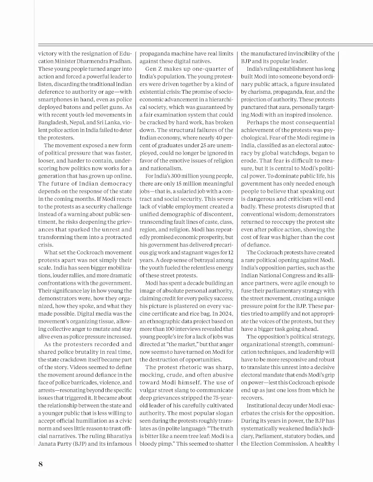
In this 116-page issue of Foreign Policy, the letter shape below appears 2,692 times across 75 pages. Editions stores it once in a shared collection of letter shapes, called a glyph store. Each page records where to draw it and which colour to use.
A bold “a” and a regular “a” have different shapes, so each has its own entry. Shapes that appear on just one page are stored with that page.
Find the same shape across the issue
Choose a letter and a page to see every place that shape appears. Turn off the highlights to read the original page.
2,692 occurrences across 75 pages. This page uses the shape 51 times.
Page number above; number of occurrences below. Scroll to explore all 116 pages.
Of 289,173 text entries, 232,667 use the shared store of 19,502 letter shapes. Text embedded in images is not included.
Preserve the detail.
Use less data
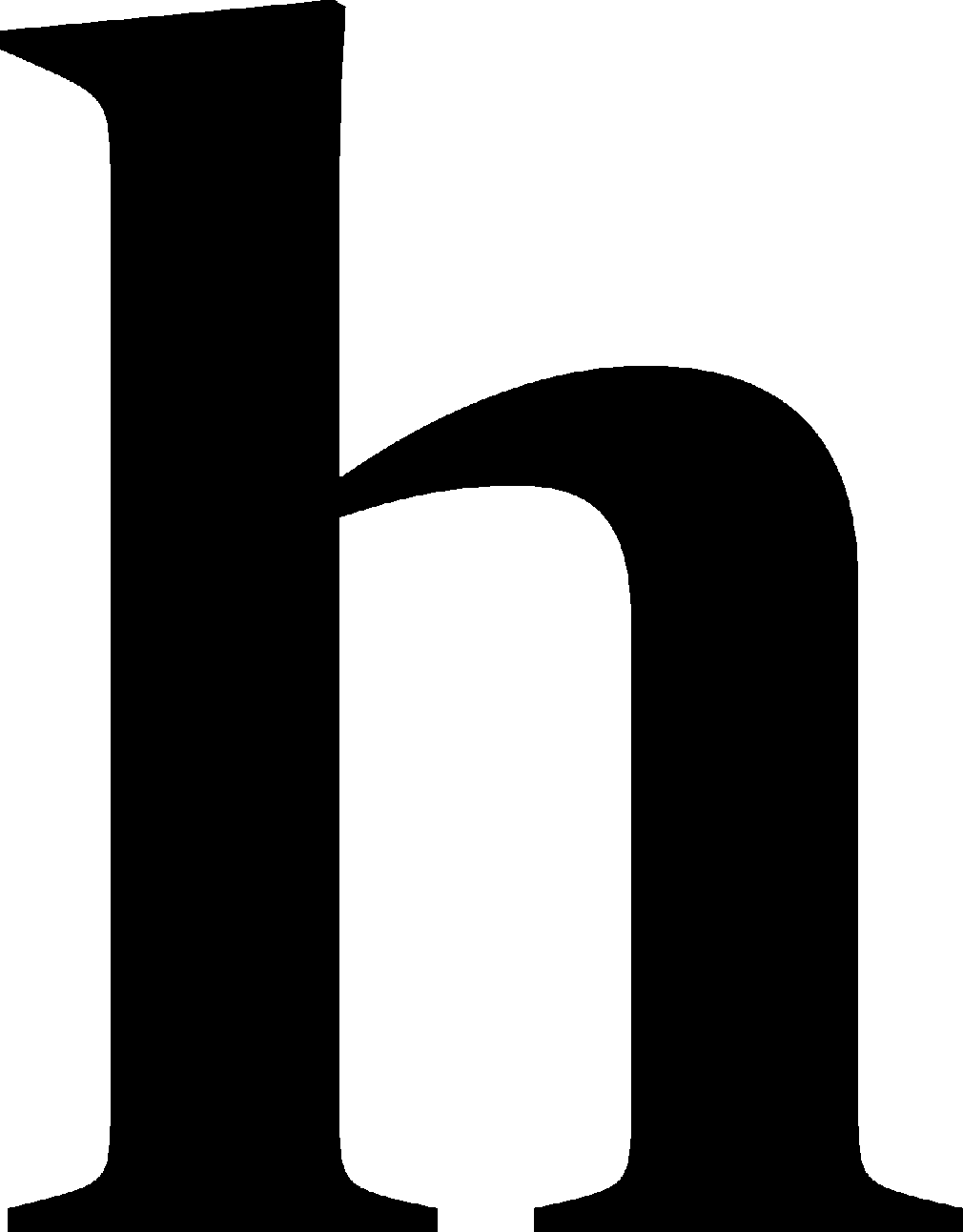
The letter “h” from this headline has 1,010 × 1,293 pixels. We record how many white pixels come in a row, then how many black pixels, and so on. That takes less data than storing each pixel separately. This is called run-length encoding (RLE), and it preserves the shape exactly.
RLE works particularly well for letters. Most rows of pixels in a Latin letter contain just one or two black runs. Two or four numbers can describe the white and black run lengths. White pixels at the end of one row continue into the first run of the next.
1,010 pixels in
4 numbers
- 226 white
- 240 black
- 306 white
- 238 black
The first white run contains 226 pixels: 110 from the previous row and 116 from this one. White pixels at the end continue into the next row’s first run.
The complete letter: 1,305,930 pixels → 4,384 RLE numbers → 1,622 bytes after gzip. Every pixel can be recovered from this data.
Compressed on its own, this letter takes up less than 2 KB. Editions normally compresses the whole glyph store together.
Small in memory and quick to draw
The shape takes about 9 KB in memory, compared with about 163 KB for a one-bit bitmap. Editions draws directly from the runs, without expanding the entire bitmap in memory.
Drawing prepared runs is substantially faster than rasterising the font’s Bézier curves. We do that conversion in advance, before the edition reaches the reader.
When text and images overlap
Headlines can sit over photographs, graphics can cover parts of letters, and lettering can be built into images. Editions preserves those relationships to reproduce the page faithfully.
Editions examines what lies behind and in front of each letter. A flat background needs only a colour value. Over a photograph, the letter is blended with the image. If another element covers part of the letter, that part must stay hidden, so the letter is retained as part of the image.


Some lettering is part of the image
The white headline is drawn separately over the purple artwork. Switch off the text layer and the headline disappears.
The words in the RAND logo stay visible because they’re part of the image. Editions combines that artwork with separately rendered type to reproduce the complete page.
The page contains 244 text entries: 195 use a flat background, 49 blend with the artwork, and 0 account for overlapping elements. These counts come from the page’s drawing instructions.
Process the PDF once
Print-quality PDFs can be large and complex. We process them on the server so the reader’s device has a simpler job: drawing the page from content that’s ready to display.
Use the same renderer everywhere
The iOS, Android and web readers use the same drawing code. They redraw type at the requested size, with precise positioning and gamma-corrected edges.