Adaptive reading mode
From printed page
to phone screen
Adaptive reading mode turns a printed article into a single column that fits the reader’s screen. Here’s how we preserve your text, pictures and typefaces along the way.
Request a demoFollow one article
from page to screen
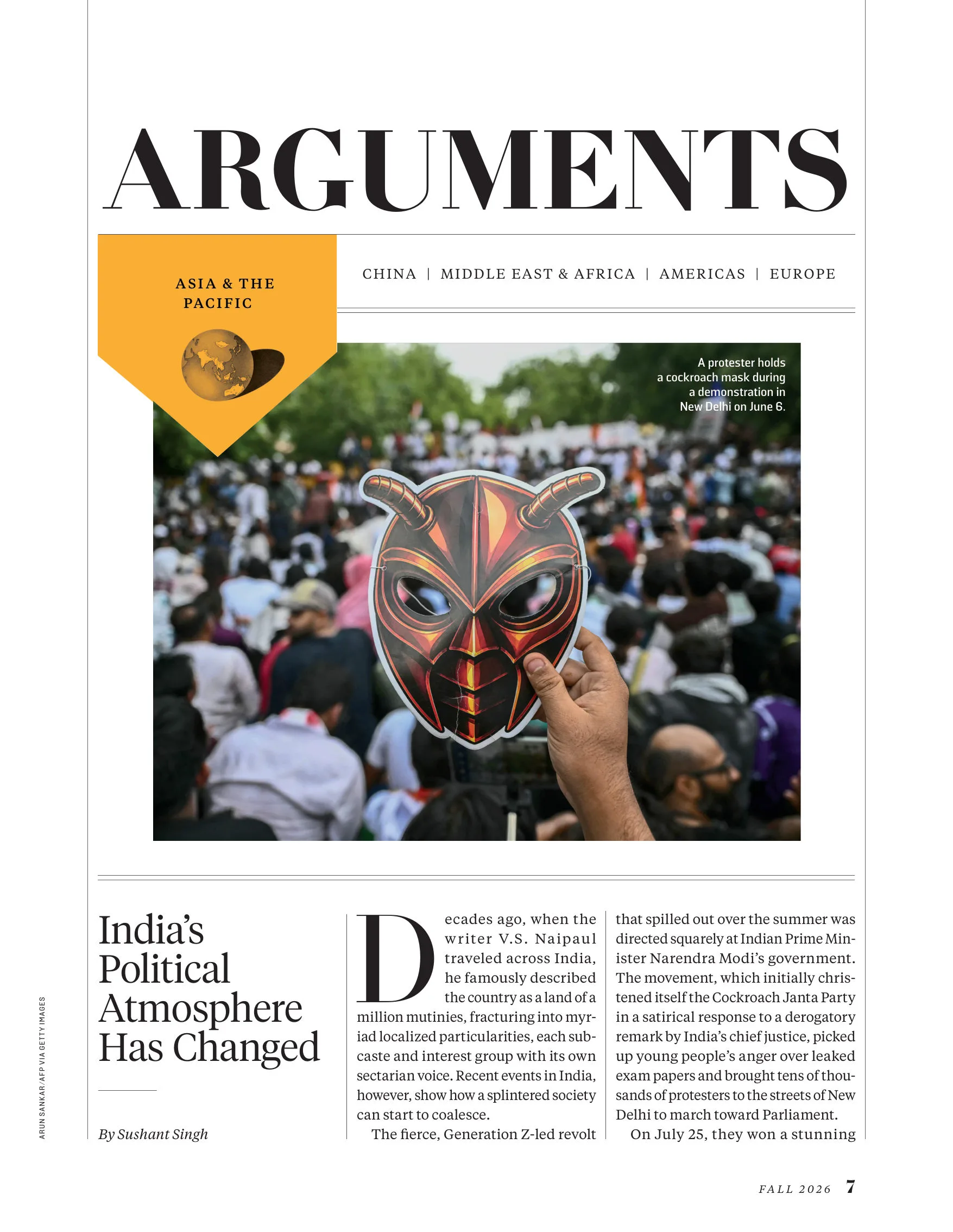
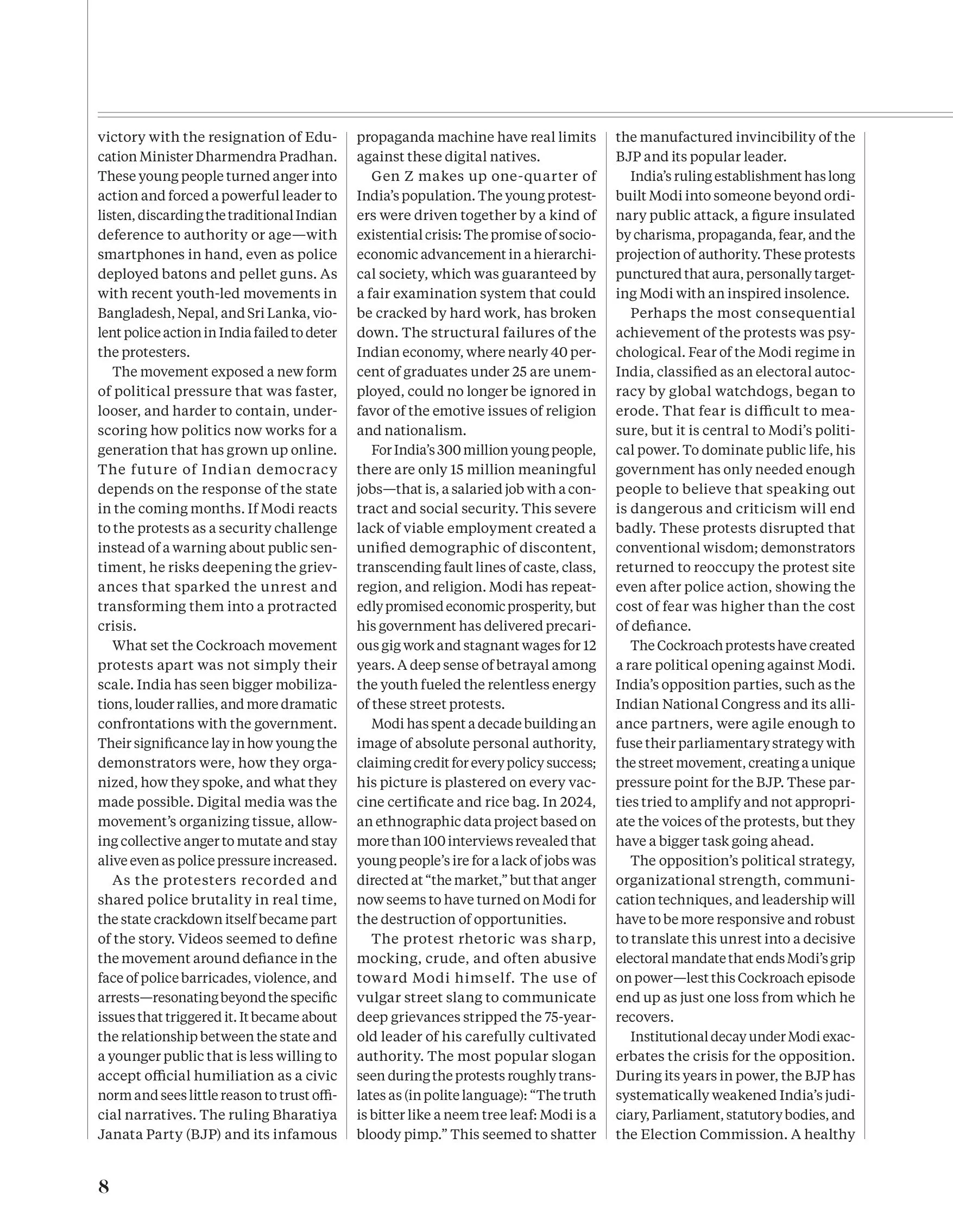
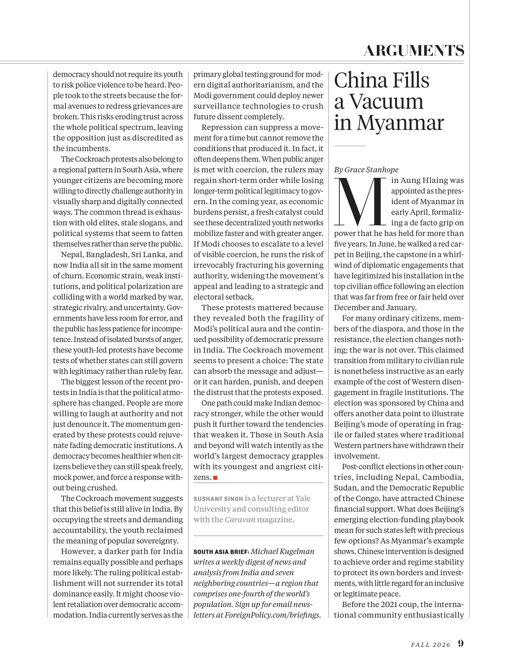
Compare a three-page Foreign Policy article with its reading-mode layout. Change the text size or column width to see how it adapts.
Loading reading mode…
How a page becomes
a reading layout
A PDF tells us where everything sits on the page. To adapt an article for the screen, we need to know which pieces belong together, what order they go in and how they should be laid out.
On the server, before publication
On the reader’s device
- 01Extract
Extract letter shapes, images and their positions from the PDF.
- 02Structure
Identify the content that belongs to each article.
- 03Design
Prepare a layout plan for a single reading column.
- 04Render
Fit the plan to the screen width and text size.
01 · Extract
Keep the details
that make it yours
The headline typeface, caption size and opening drop cap all give your publication its character. We preserve those details as well as the words.
We extract letter shapes, dimensions, colours and positions, along with photographs, rules and any structural information in the PDF. Next, we identify the headlines, match images to articles and work out how the pieces fit together.
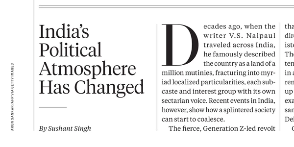
- HeadlineTiempos Headline Light, 24 pt
- Rule below the headline0.25 pt thick, 36 pt long
- BylineTiempos Text Regular Italic, 8.5 pt
- Photo creditSolido Medium, 4.5 pt, vertical
- Drop capa separate typeface, 96 pt
- Body textTiempos Text Regular, 8.5/12 pt, justified
- Original hyphenationmyr-iad
02 · Structure
Find the thread
across pages and columns
The Foreign Policy article spans three pages. We follow its text from column to column, separating it from neighbouring stories to create one continuous article.
We start with the structural information in the source. Where that’s missing, we use typefaces, text sizes, positions and rules to identify the article’s parts and their reading order.
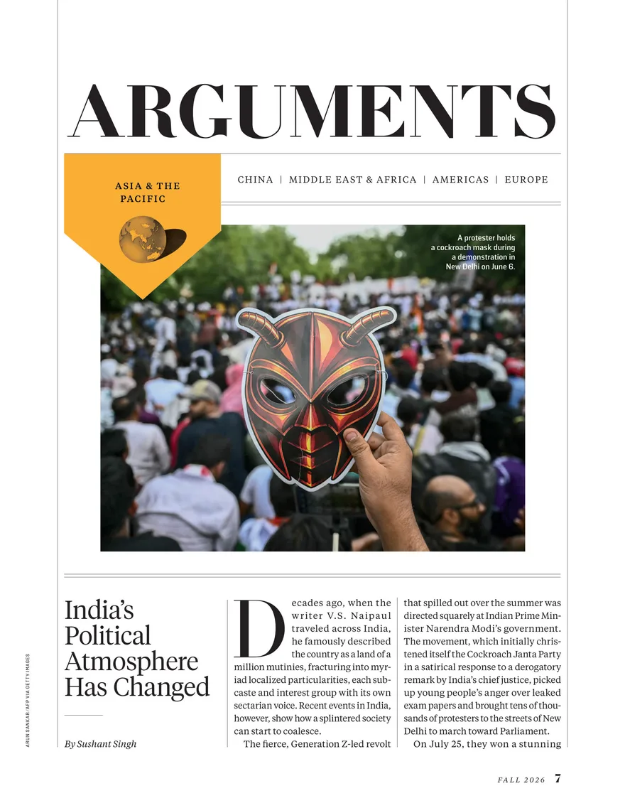 Page 7
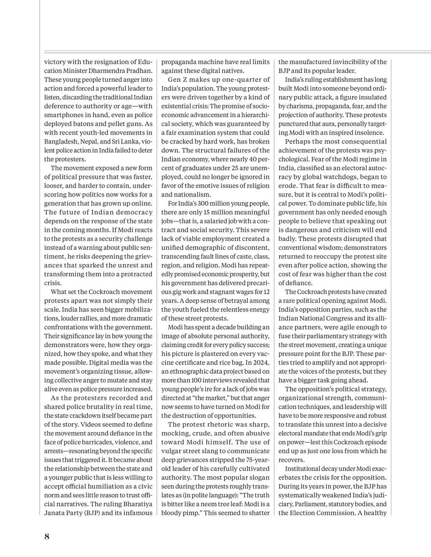 Page 8
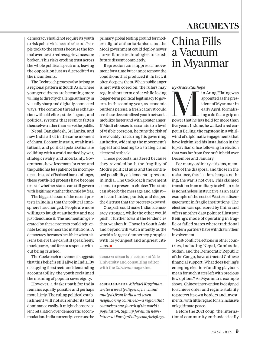 Page 9
Your editorial system can provide the structure
Foreign Policy’s InDesign PDFs supplied almost all the structure needed for this article. Where a PDF lacks that information, an XML export from your editorial system can fill the gaps. Information supplied by the source takes priority over our inferences from typography and position. The conversion doesn’t use a language model.
We always take the text and images from the final PDF. An editorial export may contain earlier wording or material that was cut before publication. Using the PDF ensures that reading mode matches the published version, word for word.
03 · Design
A layout made
for reading on screen
We create a layout plan that sets the order of the article’s elements, places images and captions, and defines the spacing around them.
The plan keeps your publication’s typography while adapting the layout for the screen. The reader’s device sets the final column width and line breaks.
Let readers see the headline first
In print, the opening photograph sits above the headline. On a phone, it would fill the screen before the reader could see the title. We move it below the headline and byline so readers can see which article they’ve opened.
Original order

In reading mode

Explore the layout decisions
Every block in the plan has a record of the rules used to lay it out. Select one below to see what stays as it was in print and what changes for reading mode. These records help us refine layouts too.
Page 7
Page 8
Page 9
Headline
Page 7
- Tiempos Headline Light, 24/24 pt
- Left aligned
- Colour #231f20
- Included in reading mode?
- Yes.
exclude.default-keep - Where in the article?
- Keep the original reading order.
order.default-keep - How large?
- Keep the proportions from print: 2.8 times the body text size. Reduce it slightly on narrow screens to avoid very short lines.
sizing.headline-floor - Which colour?
- The colour measured on the page: #231f20.
ink.default-measured - How are lines aligned?
- Left aligned, as on the page.
align.default-measured - Can words be hyphenated?
- Do not hyphenate the headline.
hyphenation.display-off - Is it indented?
- No.
indent.default-flush - How much space around it?
- Keep the printed rule below this block and account for it in the spacing.
spacing.rule-seam
Byline
Page 7
- Tiempos Text Regular Italic, 8.5 pt
- Left aligned
- Colour #231f20
- Included in reading mode?
- Yes.
exclude.default-keep - Where in the article?
- After the headline.
order.byline-closes-head - How large?
- Use the body text size and line spacing.
sizing.body-baseline-grid - Which colour?
- The colour measured on the page: #231f20.
ink.default-measured - How are lines aligned?
- Left aligned, as on the page.
align.default-measured - Can words be hyphenated?
- Yes.
hyphenation.default-on - Is it indented?
- No.
indent.default-flush - How much space around it?
- Use the default layout spacing.
spacing.default
Image, caption and credit
Page 7
- Photo credit: Solido Medium, 4.5 pt
- Caption: Solido Bold, 7.5 pt
- Included in reading mode?
- Yes.
exclude.default-keep - What stays together?
- Keep the caption and credit with the image. Move the white caption from the image to the space below it.
group.caption-with-figure - Where in the article?
- Move the image after the headline and byline, so the reader sees the headline first.
order.lead-figure-after-head - How wide?
- The full column width.
figures.default-full-width - How much space around it?
- One line of space above and below the image.
spacing.figure
Body text, paragraph 1/23
Page 7
- Tiempos Text Regular, 8.5/12 pt
- Justified
- Colour #231f20
- Included in reading mode?
- Yes.
exclude.default-keep - Where in the article?
- Keep the original reading order.
order.default-keep - How large?
- Use the body text size and line spacing. The drop cap spans no more than six lines.
sizing.body-dropcap-at-most-six - Which colour?
- The colour measured on the page: #231f20.
ink.default-measured - How are lines aligned?
- Justified, like the article’s printed columns.
align.body-follows-the-column - Can words be hyphenated?
- Yes.
hyphenation.default-on - Is it indented?
- No.
indent.default-flush - How much space around it?
- Indent each paragraph, as in print, without adding a blank line.
spacing.paragraph-indented
Body text, paragraph 2/23
Page 7
- Tiempos Text Regular, 8.5/12 pt
- Justified
- Colour #231f20
- Included in reading mode?
- Yes.
exclude.default-keep - Where in the article?
- Keep the original reading order.
order.default-keep - How large?
- Use the body text size and line spacing.
sizing.body-baseline-grid - Which colour?
- The colour measured on the page: #231f20.
ink.default-measured - How are lines aligned?
- Justified, like the article’s printed columns.
align.body-follows-the-column - Can words be hyphenated?
- Yes.
hyphenation.default-on - Is it indented?
- Yes, as on the page.
indent.page-indented - How much space around it?
- Indent each paragraph, as in print, without adding a blank line.
spacing.paragraph-indented
Body text, paragraph 3/23
Page 7
- Tiempos Text Regular, 8.5/12 pt
- Justified
- Colour #231f20
- Included in reading mode?
- Yes.
exclude.default-keep - Where in the article?
- Keep the original reading order.
order.default-keep - How large?
- Use the body text size and line spacing.
sizing.body-baseline-grid - Which colour?
- The colour measured on the page: #231f20.
ink.default-measured - How are lines aligned?
- Justified, like the article’s printed columns.
align.body-follows-the-column - Can words be hyphenated?
- Yes.
hyphenation.default-on - Is it indented?
- Yes, as on the page.
indent.page-indented - How much space around it?
- Indent each paragraph, as in print, without adding a blank line.
spacing.paragraph-indented
Body text, paragraph 4/23
Page 8
- Tiempos Text Regular, 8.5/12 pt
- Justified
- Colour #231f20
- Included in reading mode?
- Yes.
exclude.default-keep - Where in the article?
- Keep the original reading order.
order.default-keep - How large?
- Use the body text size and line spacing.
sizing.body-baseline-grid - Which colour?
- The colour measured on the page: #231f20.
ink.default-measured - How are lines aligned?
- Justified, like the article’s printed columns.
align.body-follows-the-column - Can words be hyphenated?
- Yes.
hyphenation.default-on - Is it indented?
- Yes, as on the page.
indent.page-indented - How much space around it?
- Indent each paragraph, as in print, without adding a blank line.
spacing.paragraph-indented
Body text, paragraph 5/23
Page 8
- Tiempos Text Regular, 8.5/12 pt
- Justified
- Colour #231f20
- Included in reading mode?
- Yes.
exclude.default-keep - Where in the article?
- Keep the original reading order.
order.default-keep - How large?
- Use the body text size and line spacing.
sizing.body-baseline-grid - Which colour?
- The colour measured on the page: #231f20.
ink.default-measured - How are lines aligned?
- Justified, like the article’s printed columns.
align.body-follows-the-column - Can words be hyphenated?
- Yes.
hyphenation.default-on - Is it indented?
- Yes, as on the page.
indent.page-indented - How much space around it?
- Indent each paragraph, as in print, without adding a blank line.
spacing.paragraph-indented
Body text, paragraph 6/23
Page 8
- Tiempos Text Regular, 8.5/12 pt
- Justified
- Colour #231f20
- Included in reading mode?
- Yes.
exclude.default-keep - Where in the article?
- Keep the original reading order.
order.default-keep - How large?
- Use the body text size and line spacing.
sizing.body-baseline-grid - Which colour?
- The colour measured on the page: #231f20.
ink.default-measured - How are lines aligned?
- Justified, like the article’s printed columns.
align.body-follows-the-column - Can words be hyphenated?
- Yes.
hyphenation.default-on - Is it indented?
- Yes, as on the page.
indent.page-indented - How much space around it?
- Indent each paragraph, as in print, without adding a blank line.
spacing.paragraph-indented
Body text, paragraph 7/23
Page 8
- Tiempos Text Regular, 8.5/12 pt
- Justified
- Colour #231f20
- Included in reading mode?
- Yes.
exclude.default-keep - Where in the article?
- Keep the original reading order.
order.default-keep - How large?
- Use the body text size and line spacing.
sizing.body-baseline-grid - Which colour?
- The colour measured on the page: #231f20.
ink.default-measured - How are lines aligned?
- Justified, like the article’s printed columns.
align.body-follows-the-column - Can words be hyphenated?
- Yes.
hyphenation.default-on - Is it indented?
- Yes, as on the page.
indent.page-indented - How much space around it?
- Indent each paragraph, as in print, without adding a blank line.
spacing.paragraph-indented
Body text, paragraph 8/23
Page 8
- Tiempos Text Regular, 8.5/12 pt
- Justified
- Colour #231f20
- Included in reading mode?
- Yes.
exclude.default-keep - Where in the article?
- Keep the original reading order.
order.default-keep - How large?
- Use the body text size and line spacing.
sizing.body-baseline-grid - Which colour?
- The colour measured on the page: #231f20.
ink.default-measured - How are lines aligned?
- Justified, like the article’s printed columns.
align.body-follows-the-column - Can words be hyphenated?
- Yes.
hyphenation.default-on - Is it indented?
- Yes, as on the page.
indent.page-indented - How much space around it?
- Indent each paragraph, as in print, without adding a blank line.
spacing.paragraph-indented
Body text, paragraph 9/23
Page 8
- Tiempos Text Regular, 8.5/12 pt
- Justified
- Colour #231f20
- Included in reading mode?
- Yes.
exclude.default-keep - Where in the article?
- Keep the original reading order.
order.default-keep - How large?
- Use the body text size and line spacing.
sizing.body-baseline-grid - Which colour?
- The colour measured on the page: #231f20.
ink.default-measured - How are lines aligned?
- Justified, like the article’s printed columns.
align.body-follows-the-column - Can words be hyphenated?
- Yes.
hyphenation.default-on - Is it indented?
- Yes, as on the page.
indent.page-indented - How much space around it?
- Indent each paragraph, as in print, without adding a blank line.
spacing.paragraph-indented
Body text, paragraph 10/23
Page 8
- Tiempos Text Regular, 8.5/12 pt
- Justified
- Colour #231f20
- Included in reading mode?
- Yes.
exclude.default-keep - Where in the article?
- Keep the original reading order.
order.default-keep - How large?
- Use the body text size and line spacing.
sizing.body-baseline-grid - Which colour?
- The colour measured on the page: #231f20.
ink.default-measured - How are lines aligned?
- Justified, like the article’s printed columns.
align.body-follows-the-column - Can words be hyphenated?
- Yes.
hyphenation.default-on - Is it indented?
- Yes, as on the page.
indent.page-indented - How much space around it?
- Indent each paragraph, as in print, without adding a blank line.
spacing.paragraph-indented
Body text, paragraph 11/23
Page 8
- Tiempos Text Regular, 8.5/12 pt
- Justified
- Colour #231f20
- Included in reading mode?
- Yes.
exclude.default-keep - Where in the article?
- Keep the original reading order.
order.default-keep - How large?
- Use the body text size and line spacing.
sizing.body-baseline-grid - Which colour?
- The colour measured on the page: #231f20.
ink.default-measured - How are lines aligned?
- Justified, like the article’s printed columns.
align.body-follows-the-column - Can words be hyphenated?
- Yes.
hyphenation.default-on - Is it indented?
- Yes, as on the page.
indent.page-indented - How much space around it?
- Indent each paragraph, as in print, without adding a blank line.
spacing.paragraph-indented
Body text, paragraph 12/23
Page 8
- Tiempos Text Regular, 8.5/12 pt
- Justified
- Colour #231f20
- Included in reading mode?
- Yes.
exclude.default-keep - Where in the article?
- Keep the original reading order.
order.default-keep - How large?
- Use the body text size and line spacing.
sizing.body-baseline-grid - Which colour?
- The colour measured on the page: #231f20.
ink.default-measured - How are lines aligned?
- Justified, like the article’s printed columns.
align.body-follows-the-column - Can words be hyphenated?
- Yes.
hyphenation.default-on - Is it indented?
- Yes, as on the page.
indent.page-indented - How much space around it?
- Indent each paragraph, as in print, without adding a blank line.
spacing.paragraph-indented
Body text, paragraph 13/23
Page 8
- Tiempos Text Regular, 8.5/12 pt
- Justified
- Colour #231f20
- Included in reading mode?
- Yes.
exclude.default-keep - Where in the article?
- Keep the original reading order.
order.default-keep - How large?
- Use the body text size and line spacing.
sizing.body-baseline-grid - Which colour?
- The colour measured on the page: #231f20.
ink.default-measured - How are lines aligned?
- Justified, like the article’s printed columns.
align.body-follows-the-column - Can words be hyphenated?
- Yes.
hyphenation.default-on - Is it indented?
- Yes, as on the page.
indent.page-indented - How much space around it?
- Indent each paragraph, as in print, without adding a blank line.
spacing.paragraph-indented
Body text, paragraph 14/23
Page 8
- Tiempos Text Regular, 8.5/12 pt
- Justified
- Colour #231f20
- Included in reading mode?
- Yes.
exclude.default-keep - Where in the article?
- Keep the original reading order.
order.default-keep - How large?
- Use the body text size and line spacing.
sizing.body-baseline-grid - Which colour?
- The colour measured on the page: #231f20.
ink.default-measured - How are lines aligned?
- Justified, like the article’s printed columns.
align.body-follows-the-column - Can words be hyphenated?
- Yes.
hyphenation.default-on - Is it indented?
- Yes, as on the page.
indent.page-indented - How much space around it?
- Indent each paragraph, as in print, without adding a blank line.
spacing.paragraph-indented
Body text, paragraph 15/23
Page 8
- Tiempos Text Regular, 8.5/12 pt
- Justified
- Colour #231f20
- Included in reading mode?
- Yes.
exclude.default-keep - Where in the article?
- Keep the original reading order.
order.default-keep - How large?
- Use the body text size and line spacing.
sizing.body-baseline-grid - Which colour?
- The colour measured on the page: #231f20.
ink.default-measured - How are lines aligned?
- Justified, like the article’s printed columns.
align.body-follows-the-column - Can words be hyphenated?
- Yes.
hyphenation.default-on - Is it indented?
- Yes, as on the page.
indent.page-indented - How much space around it?
- Indent each paragraph, as in print, without adding a blank line.
spacing.paragraph-indented
Body text, paragraph 16/23
Page 9
- Tiempos Text Regular, 8.5/12 pt
- Justified
- Colour #231f20
- Included in reading mode?
- Yes.
exclude.default-keep - Where in the article?
- Keep the original reading order.
order.default-keep - How large?
- Use the body text size and line spacing.
sizing.body-baseline-grid - Which colour?
- The colour measured on the page: #231f20.
ink.default-measured - How are lines aligned?
- Justified, like the article’s printed columns.
align.body-follows-the-column - Can words be hyphenated?
- Yes.
hyphenation.default-on - Is it indented?
- Yes, as on the page.
indent.page-indented - How much space around it?
- Indent each paragraph, as in print, without adding a blank line.
spacing.paragraph-indented
Body text, paragraph 17/23
Page 9
- Tiempos Text Regular, 8.5/12 pt
- Justified
- Colour #231f20
- Included in reading mode?
- Yes.
exclude.default-keep - Where in the article?
- Keep the original reading order.
order.default-keep - How large?
- Use the body text size and line spacing.
sizing.body-baseline-grid - Which colour?
- The colour measured on the page: #231f20.
ink.default-measured - How are lines aligned?
- Justified, like the article’s printed columns.
align.body-follows-the-column - Can words be hyphenated?
- Yes.
hyphenation.default-on - Is it indented?
- Yes, as on the page.
indent.page-indented - How much space around it?
- Indent each paragraph, as in print, without adding a blank line.
spacing.paragraph-indented
Body text, paragraph 18/23
Page 9
- Tiempos Text Regular, 8.5/12 pt
- Justified
- Colour #231f20
- Included in reading mode?
- Yes.
exclude.default-keep - Where in the article?
- Keep the original reading order.
order.default-keep - How large?
- Use the body text size and line spacing.
sizing.body-baseline-grid - Which colour?
- The colour measured on the page: #231f20.
ink.default-measured - How are lines aligned?
- Justified, like the article’s printed columns.
align.body-follows-the-column - Can words be hyphenated?
- Yes.
hyphenation.default-on - Is it indented?
- Yes, as on the page.
indent.page-indented - How much space around it?
- Indent each paragraph, as in print, without adding a blank line.
spacing.paragraph-indented
Body text, paragraph 19/23
Page 9
- Tiempos Text Regular, 8.5/12 pt
- Justified
- Colour #231f20
- Included in reading mode?
- Yes.
exclude.default-keep - Where in the article?
- Keep the original reading order.
order.default-keep - How large?
- Use the body text size and line spacing.
sizing.body-baseline-grid - Which colour?
- The colour measured on the page: #231f20.
ink.default-measured - How are lines aligned?
- Justified, like the article’s printed columns.
align.body-follows-the-column - Can words be hyphenated?
- Yes.
hyphenation.default-on - Is it indented?
- Yes, as on the page.
indent.page-indented - How much space around it?
- Indent each paragraph, as in print, without adding a blank line.
spacing.paragraph-indented
Body text, paragraph 20/23
Page 9
- Tiempos Text Regular, 8.5/12 pt
- Justified
- Colour #231f20
- Included in reading mode?
- Yes.
exclude.default-keep - Where in the article?
- Keep the original reading order.
order.default-keep - How large?
- Use the body text size and line spacing.
sizing.body-baseline-grid - Which colour?
- The colour measured on the page: #231f20.
ink.default-measured - How are lines aligned?
- Justified, like the article’s printed columns.
align.body-follows-the-column - Can words be hyphenated?
- Yes.
hyphenation.default-on - Is it indented?
- Yes, as on the page.
indent.page-indented - How much space around it?
- Indent each paragraph, as in print, without adding a blank line.
spacing.paragraph-indented
Body text, paragraph 21/23
Page 9
- Tiempos Text Regular, 8.5/12 pt
- Justified
- Colour #231f20
- Included in reading mode?
- Yes.
exclude.default-keep - Where in the article?
- Keep the original reading order.
order.default-keep - How large?
- Use the body text size and line spacing.
sizing.body-baseline-grid - Which colour?
- The colour measured on the page: #231f20.
ink.default-measured - How are lines aligned?
- Justified, like the article’s printed columns.
align.body-follows-the-column - Can words be hyphenated?
- Yes.
hyphenation.default-on - Is it indented?
- Yes, as on the page.
indent.page-indented - How much space around it?
- Indent each paragraph, as in print, without adding a blank line.
spacing.paragraph-indented
Body text, paragraph 22/23
Page 9
- Tiempos Text Regular, 8.5/12 pt
- Justified
- Colour #231f20
- Included in reading mode?
- Yes.
exclude.default-keep - Where in the article?
- Keep the original reading order.
order.default-keep - How large?
- Use the body text size and line spacing.
sizing.body-baseline-grid - Which colour?
- The colour measured on the page: #231f20.
ink.default-measured - How are lines aligned?
- Justified, like the article’s printed columns.
align.body-follows-the-column - Can words be hyphenated?
- Yes.
hyphenation.default-on - Is it indented?
- Yes, as on the page.
indent.page-indented - How much space around it?
- Indent each paragraph, as in print, without adding a blank line.
spacing.paragraph-indented
Body text, paragraph 23/23
Page 9
- Tiempos Text Regular, 8.5/12 pt
- Justified
- Colour #231f20
- Included in reading mode?
- Yes.
exclude.default-keep - Where in the article?
- Keep the original reading order.
order.default-keep - How large?
- Use the body text size and line spacing.
sizing.body-baseline-grid - Which colour?
- The colour measured on the page: #231f20.
ink.default-measured - How are lines aligned?
- Justified, like the article’s printed columns.
align.body-follows-the-column - Can words be hyphenated?
- Yes.
hyphenation.default-on - Is it indented?
- Yes, as on the page.
indent.page-indented - How much space around it?
- Spacing is based on measurements from 12 places in the publication.
spacing.default
Info box
Page 9
- Tiempos Text Medium, 8.5/12 pt
- Left aligned
- Colour #939598
- Included in reading mode?
- Yes.
exclude.default-keep - Where in the article?
- Keep the original reading order.
order.default-keep - How large?
- Use the body text size and line spacing.
sizing.body-baseline-grid - Which colour?
- The colour measured on the page: #939598.
ink.default-measured - How are lines aligned?
- Left aligned, as on the page.
align.default-measured - Can words be hyphenated?
- Yes.
hyphenation.default-on - Is it indented?
- No.
indent.default-flush - How much space around it?
- Keep the printed rule above the info box. Spacing is based on measurements from 5 places in the publication.
spacing.box-opener
Info box
Page 9
- Tiempos Text Regular Italic, 8.5/12 pt
- Left aligned
- Colour #231f20
- Included in reading mode?
- Yes.
exclude.default-keep - Where in the article?
- Keep the original reading order.
order.default-keep - How large?
- Use the body text size and line spacing.
sizing.body-baseline-grid - Which colour?
- The colour measured on the page: #231f20.
ink.default-measured - How are lines aligned?
- Left aligned, as on the page.
align.default-measured - Can words be hyphenated?
- Yes.
hyphenation.default-on - Is it indented?
- No.
indent.default-flush - How much space around it?
- Keep the printed rule below this block and account for it in the spacing.
spacing.rule-seam
- Headlines keep their proportions
- The headline’s size relative to the body text comes from print. On narrow screens, we reduce large headlines slightly to avoid lines with only a few letters.
- Spacing follows the printed page
- Spacing is based on measurements from the original pages and scales with the text size.
- Colour is part of the typography
- We keep the original text colours, adjusting them when needed for legibility. For example, a white caption moved from a photograph to a light background takes the body text colour.
Validate
Check every word.
Check the layout
Automated checks compare the article with its source and verify the layout dimensions.
The checks use the same layout engine as the reader’s device. If an article fails, readers can still read it on the original page, but it won’t be offered in reading mode.
- Every word accounted for
- The checks verify that every word is present exactly once and in the original reading order.
- A layout that fits
- Images must be present, lines must fit the column and elements must not overlap.
- Visual review during development
- We also review layouts against the printed pages by eye, then use what we learn to improve the rules for future articles.
This example passed: all 28 blocks and every word accounted for.
04 · Render
The final layout happens
on the reader’s screen
When the reader opens an article, its structure and layout plan are already prepared. The device calculates line breaks, adjusts word spacing and draws the article to fit the available width.
It uses the same letter shapes extracted from the PDF, preserving the typefaces and spacing within words. If the reader changes the text size or rotates the device, it recalculates the lines using the same plan.

One layout engine, from checks to reading
The server’s checks, the browser and the iOS app use the same layout engine. This lets us develop and check line breaks and layout dimensions in one place.